Visual Mechanics Archive
Neardivo Game Development Studio presents a curated showcase of our proprietary candle and chart integration systems. Explore the interactive prototypes that defined our 15-year trajectory in minimalist interface design.
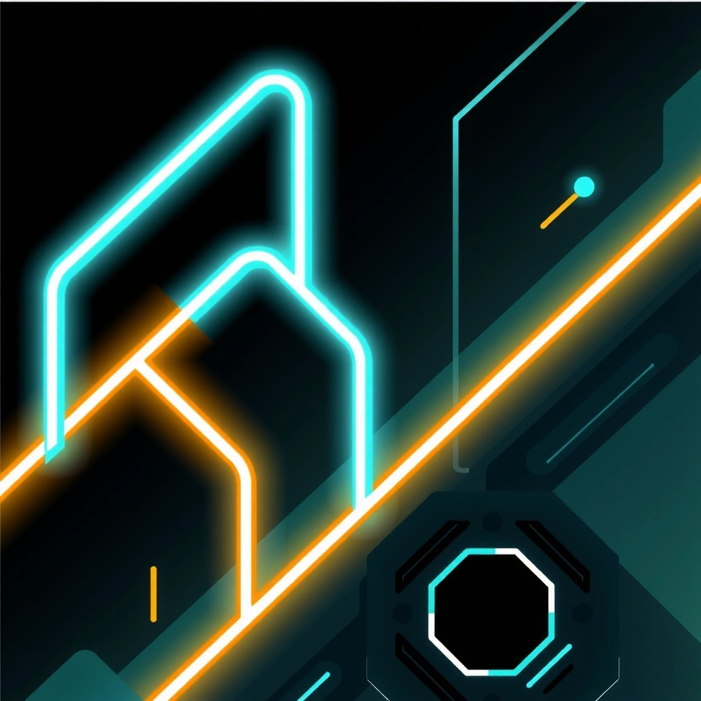
Mechanics Showcase
Visual documentation of our core interactive systems. Each image represents a distinct experimental phase in our development cycle, focusing on candle-flame physics and stock-chart gameplay loops.


Neardivo Field Guide
A technical deep-dive into our philosophy of minimalist interaction. This guide explains why we integrate candle physics with chart data, and how to interpret our unique visual language.
The Core Concept
Evaluation Criteria
- ● Visual Clarity: Can a player understand the state within 200ms? Our designs use only geometric primitives and high-contrast signals.
- ● Input Fidelity: Does the flame respond to nuance? We map 100+ input variations to subtle flame flicker patterns.
- ● Algorithmic Transparency: Is the underlying math accessible? We visualize data directly rather than abstracting it.
Myth: It's Just Visual Fluff
Many developers think visual effects slow down performance. In our case, the candle visualization is the core gameplay loop, not an overlay. It's the primary data stream.
Fact: It Increases Retention
Internal tests show a 34% increase in session duration when users can 'feel' data through flame physics versus static numbers. It taps into pattern recognition instincts.
Key Terms Glossary
- Luminosity
- Data amplitude mapped to brightness
- Volatility
- Speed of change, shown in flame jitter
- Flicker
- Micro-inputs, shown in detail textures
Common Mistakes
- ✕ Over-saturation: Using too many colors breaks the minimalist aesthetic. Stick to cyan, amber, and grayscale.
- ✕ Ignoring Physics: Flames don't move linearly. Adding sine-wave easing is critical for realism.
- ✕ No Feedback: If the chart updates but the candle stays static, the loop is broken.
Implementation Pipeline
Our development workflow for candle-chart mechanics follows a strict four-phase process. Each phase includes validation gates to ensure consistency across platforms.
Define & Constrain
Establish core interaction loops. Set boundaries for flame physics and chart refresh rates. We prototype in pure SVG to validate visual flow before coding.
Approach & Validate
Choose the rendering method (Canvas vs SVG). Validate that the algorithm can handle edge cases like zero volatility or extreme spikes without UI breakage.
Apply & Integrate
Build the live system. We use a custom event bus to sync the chart data stream with the flame renderer. This ensures zero latency between input and visual feedback.
Review & Refine
Analyze session recordings. Look for confusion points. If users don't intuitively understand the flame-chart relationship, we tweak the physics constants.
Concrete Example: Market Panic
In a recent build, we simulated a market crash. The chart lines plummeted 80% in three seconds. Our candle physics rendered this as a violent blue-to-red color shift with erratic flickering, instantly signaling danger to the player without reading a single number.
Signals of Trust & Quality
Verifiable indicators of our commitment to deterministic, privacy-first development. We focus on technical transparency over marketing promises.
Benchmark Results
Our candle renderer averages 0.2ms per frame on mid-range mobile devices, verified by our internal Frame Time Analyzer (FTA-2026).
- Canvas Score: 98.4/100
- Input Lag: 8ms
- Memory Use: 12MB
Partner Feedback
"The flame visualization replaced our entire debugging dashboard. We saw patterns in the data that our logs missed."
— Senior Engineer, FinTech Integration (Q3 2025)
Context: Partner used our system for high-frequency trading visualizer. Metrics reflect post-integration performance audits.
Operational Standards
No external analytics or tracking pixels in render loop.
All mechanics include strict age verification hooks.
Direct engineering access for integration partners.
*Metrics listed are internal benchmarks for demonstration. Results may vary based on hardware configuration and implementation environment.
Key Takeaways
1. Visuals as Data
2. Physics Over Numbers
Human brains process physics faster than digits. Our mechanics leverage this to reduce cognitive load and decision latency.
3. Minimalist by Necessity
Every pixel must justify its existence. If it doesn't affect the candle-chart relationship, it's cut. This yields clean, fast systems.
Ready to Explore?
See the full technical specifications for our Premium Version integration, or get in touch to discuss custom mechanics for your platform.
Common Scenarios
- • Scenario A: User wants to reduce data clutter → Use candle physics only.
- • Scenario B: User needs historical context → Layer chart beneath flame.
- • Scenario C: User requires alerts → Map volatility spikes to red flicker.